Mobile first design has emerged as a vital approach in web and app development, reflecting the reality that most users now access digital content through smartphones. Unlike traditional design methods that adapt desktop layouts for smaller screens, mobile-first design begins with the constraints and possibilities of mobile devices, ensuring a streamlined and efficient user experience from the outset.
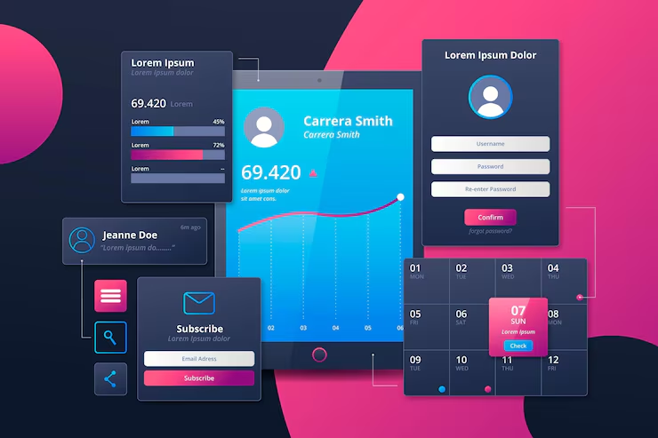
A mobile first approach prioritizes simplicity and clarity. Limited screen space requires designers to focus on essential content and functionality, eliminating unnecessary elements that could distract or overwhelm users. By concentrating on core features, designers create interfaces that are intuitive and easy to navigate, improving usability for all audiences.
Performance optimization is central to mobile first design. Fast loading pages and minimal resource consumption are crucial because mobile networks can be slower or less stable than wired connections. Techniques such as image compression, code minification, and efficient asset loading help ensure smooth performance and reduce user frustration, which can lead to higher engagement and lower bounce rates.
Touch interactions define mobile first design. Buttons, menus, and interactive elements must be appropriately sized and spaced to accommodate finger taps, gestures, and swipes. Designers also consider ergonomics, placing key actions within easy reach to minimize effort and create a more comfortable experience.
Responsive layouts remain important within a mobile first framework. While the initial focus is on smaller screens, the design must scale seamlessly to tablets and desktops. Using flexible grids, relative units, and adaptive components allows content to adjust naturally across device sizes without losing readability, aesthetic appeal, or functionality.
Testing is critical to mobile first development. Designers and developers must evaluate prototypes on multiple devices, screen sizes, and orientations to identify usability issues. Gathering feedback from real users helps refine the interface and ensures that the design meets user expectations under various conditions.
Content strategy also plays a role. Prioritizing concise text, clear visuals, and actionable elements ensures that users can access information quickly and efficiently. Mobile first design encourages presenting content in digestible segments, with progressive disclosure for secondary information to maintain focus and clarity.
In conclusion, mobile first design is a strategic methodology that emphasizes user experience, performance, and accessibility on smartphones while remaining adaptable to larger screens. By focusing on essential features, touch-friendly interactions, responsive layouts, and optimized content, designers create digital products that are fast, engaging, and user-centric, meeting the demands of today’s mobile-driven world.