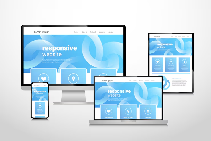
Responsive design has become a standard in modern web development, ensuring that websites function effectively and look appealing across various devices and screen sizes. With the growing diversity of smartphones, tablets, laptops, and desktop monitors, creating adaptable layouts is no longer optional but essential for user engagement and satisfaction.
At its core, responsive design relies on flexible grids and layouts. Instead of fixed-width elements, designers use relative units such as percentages or ems to allow content to adjust dynamically. This flexibility ensures that elements like text, images, and navigation menus maintain proper proportions regardless of the screen size, creating a consistent and readable interface.
Media queries are a critical tool in responsive design. These CSS techniques enable designers to apply different styles based on device characteristics, such as screen width, resolution, or orientation. By tailoring the layout and elements to specific conditions, media queries optimize usability and enhance visual appeal, preventing users from experiencing cramped or distorted interfaces.
Scalable images and media contribute significantly to a smooth responsive experience. Using vector graphics, adaptive images, and modern formats like WebP allows content to resize without losing quality. This approach reduces load times, maintains clarity, and ensures that visual elements remain engaging across devices.
Navigation design also plays a key role. Responsive menus, collapsible sections, and touch friendly buttons make it easier for users to interact with content on smaller screens. Prioritizing essential navigation items while simplifying the interface improves accessibility and reduces frustration, particularly for mobile users.
Testing and performance optimization are integral to responsive design. Developers should test websites on multiple devices and browsers to identify layout issues, slow-loading elements, or inconsistencies. Optimizing code, compressing images, and minimizing unnecessary scripts help ensure fast and smooth performance, which is crucial for retaining visitors and reducing bounce rates.
Finally, responsive design extends beyond technical implementation. It involves considering user behavior, content priorities, and context. For example, mobile users may prefer quick access to contact information, maps, or simplified forms, while desktop users might engage more deeply with detailed content and interactive features. Designing with these differences in mind enhances overall usability.
In conclusion, responsive design is a combination of flexible layouts, adaptive media, strategic navigation, and performance optimization. By focusing on these elements, developers can create websites that provide a seamless experience across all devices, improving accessibility, engagement, and user satisfaction in an increasingly multi-device world.